Giveaway
A hyper-local neighborhood app designed to help people declutter by giving away reusable items to neighbors.
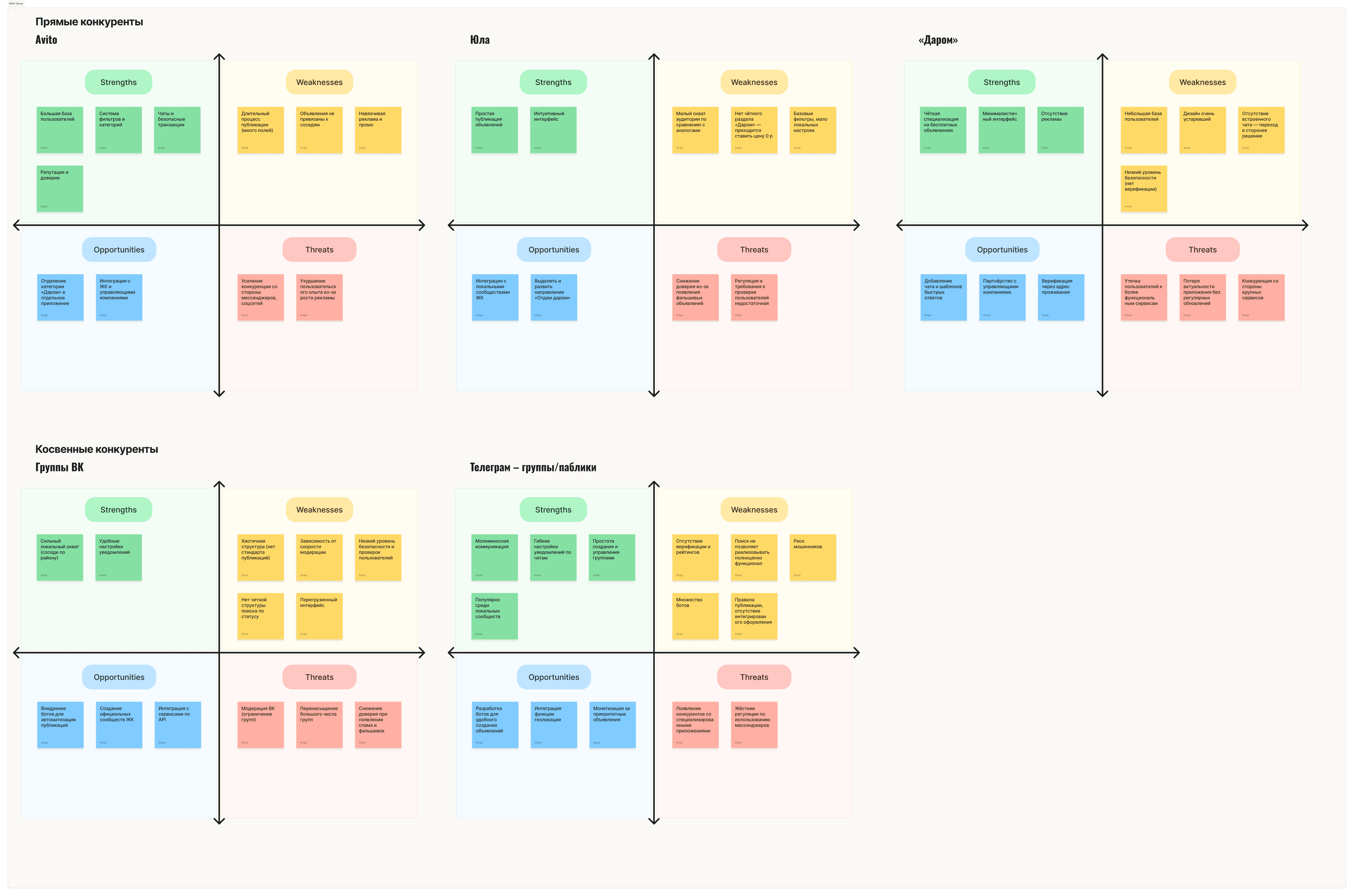
The Challenge
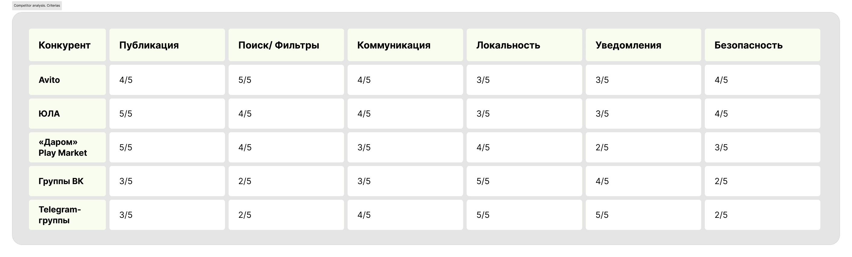
Current C2C marketplaces (like Facebook Marketplace or Craigslist) fail at local micro-transactions.
Giving away a $0 item isn't worth dealing with cross-city logistics, spam calls, and safety concerns. People end up hoarding or throwing things away.
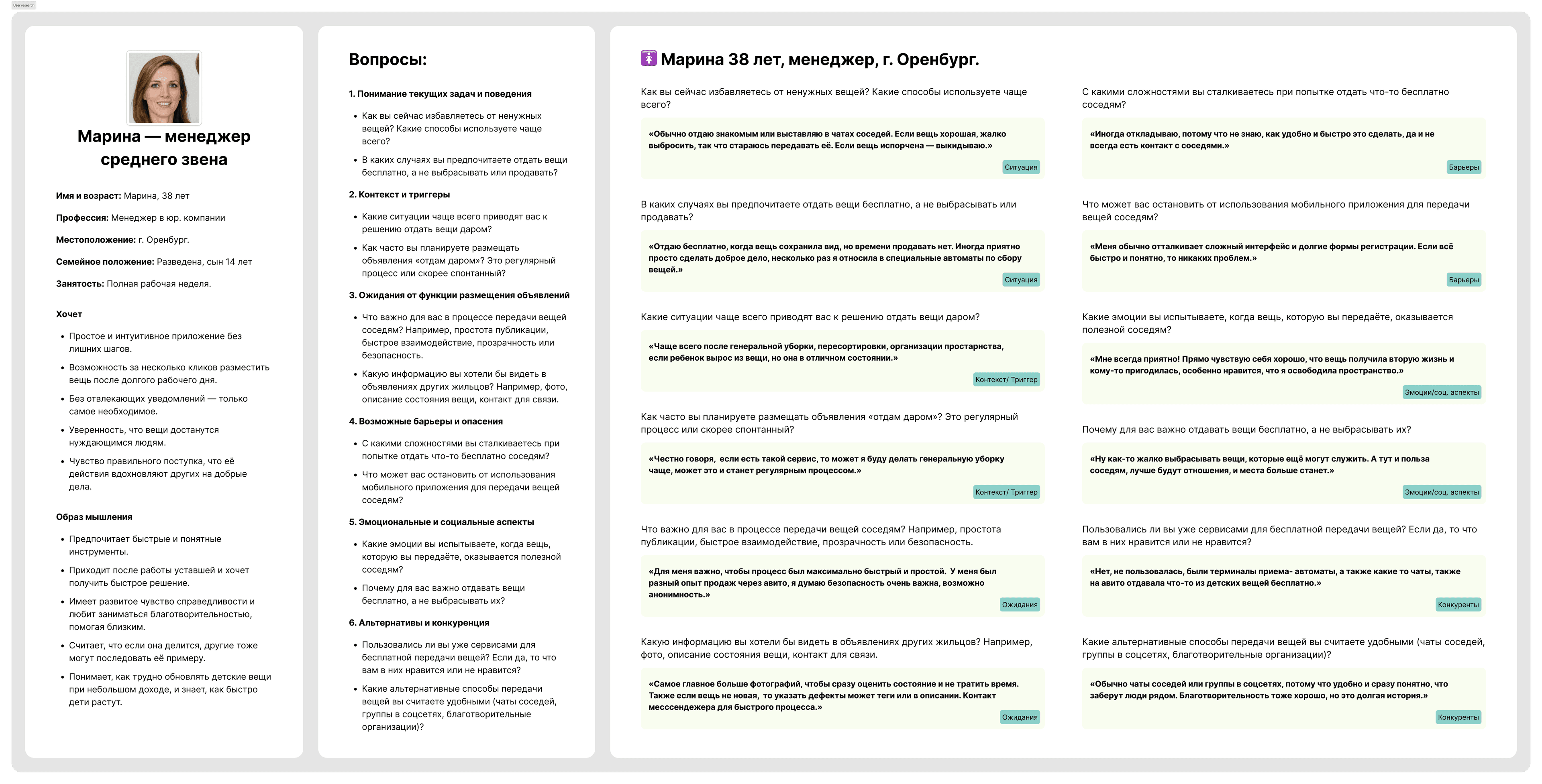
Discovery & Empathy
Understanding neighborhood dynamics was crucial before pushing pixels. Trust is the ultimate currency in local communities.
I conducted deep-dive interviews with core personas, focusing on busy professionals and young parents.
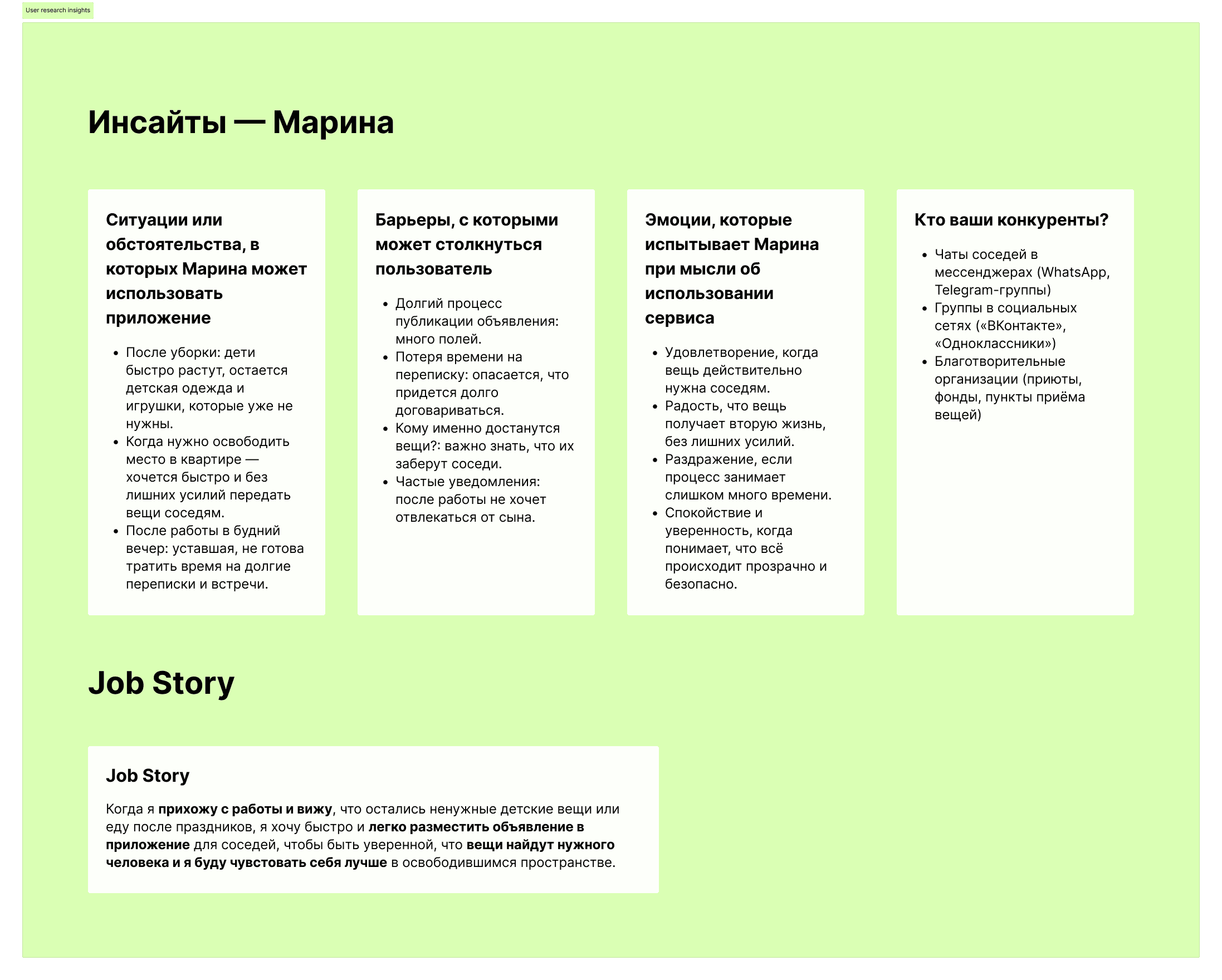
Key Insights
- ■Users reject the "marketplace vibe." Giving away is an emotional act requiring safety and speed.
- ■To overcome the fear of meeting strangers, we anchored the architecture around verified local address.
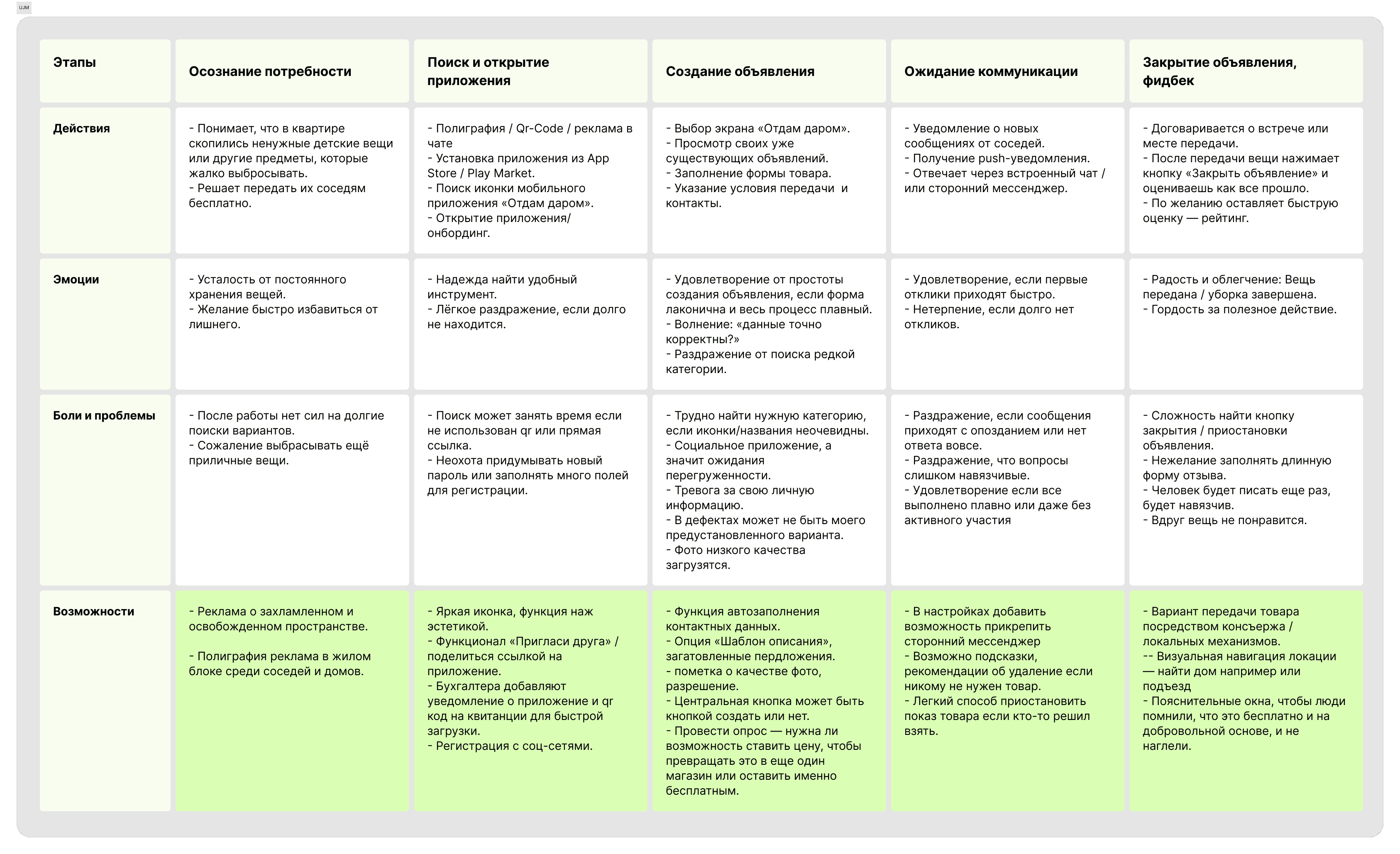
Bottlenecks & Decisions
Working in a strict Lean UX framework, we made ruthless trade-offs to keep the MVP within a 14-day scope.
The Paradox
- ■Problem: Givers want to publish in 1 click. Takers demand detailed photos and text to feel secure.
- ■Solution: Replaced tedious open text fields with predefined smart tags and mandatory quick-photo uploads. This forced givers to provide structured details instantly, satisfying takers' need for transparency without slowing down the creation process.
- ■Scope Management: Stakeholders saw a "Super App" potential. I advocated keeping the MVP strictly focused on the giveaway loop to validate the core mechanic.
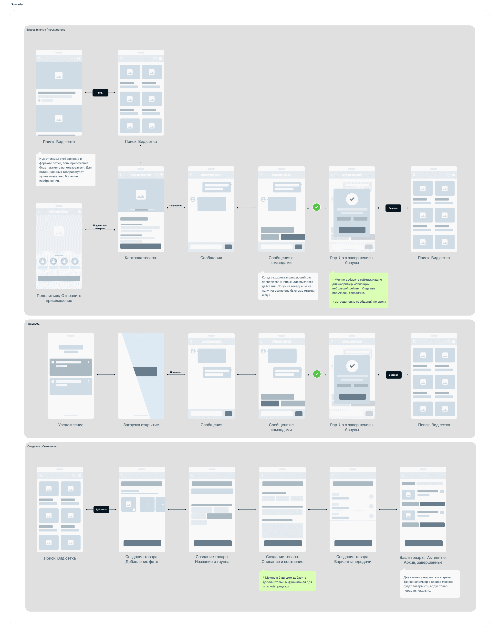
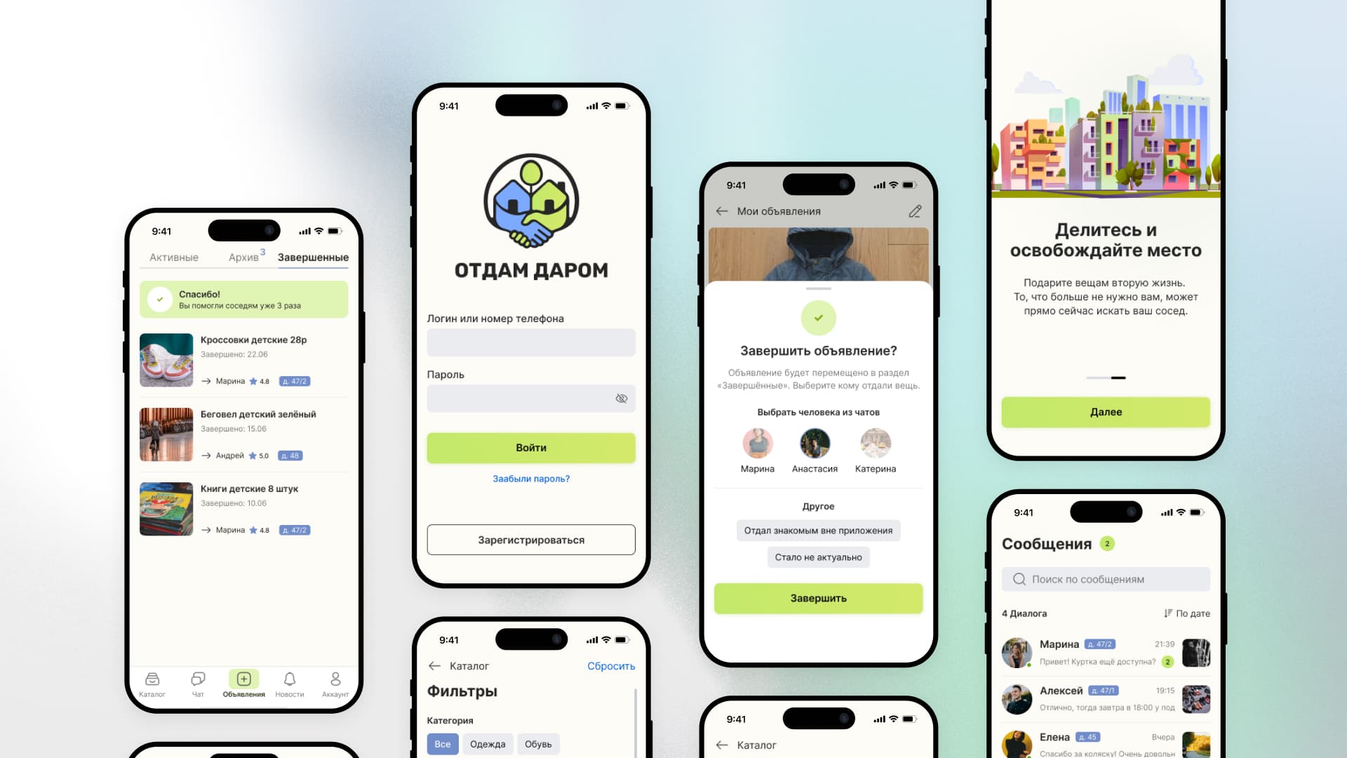
Interface & Execution
The UI needed to communicate clarity, safety, and renewal instantly.
Design System
- ■Visual Language: Vibrant, eco-friendly green (#CBE96A) as the primary accent to reinforce the psychology of "second life". Balanced by a calming, trustworthy complementary blue (#718DC9) to foster security in local interactions.
- ■Accessibility: High-contrast typography and oversized tap targets for a broad demographic.
- ■Frictionless Comms: Replaced open chat with templated "Smart Replies" to speed up handovers.
Outcome
- ↳Delivered high-fidelity screens and validated user flows for the stakeholder pitch within the tight 2-week deadline.
- ↳Established a scalable UX foundation that secures investor confidence, ready to be expanded into a broader neighborhood ecosystem.
Gallery


